Achieving color illusion in longarm quilting – Part 3: Luminosity
Welcome to the last of our three-part series on creating magical color effects in your quilts.
We explored how to create the illusion of transparency (seeing through) in Part 1 and luster (light moving across) in Part 2. We’re wrapping up with luminosity (glowing) in Part 3.
If you are new to exploring aspects of color in quilting, you may want to review the APQS blog series on Color: Part 1 Hue and Value, Part 2 Intensity and Neutrals and Part 3 Putting It All Together. If you want a refresher on color relationship terms, we recommend this APQS blog on Color by Dawn Cavanaugh.
Luminosity
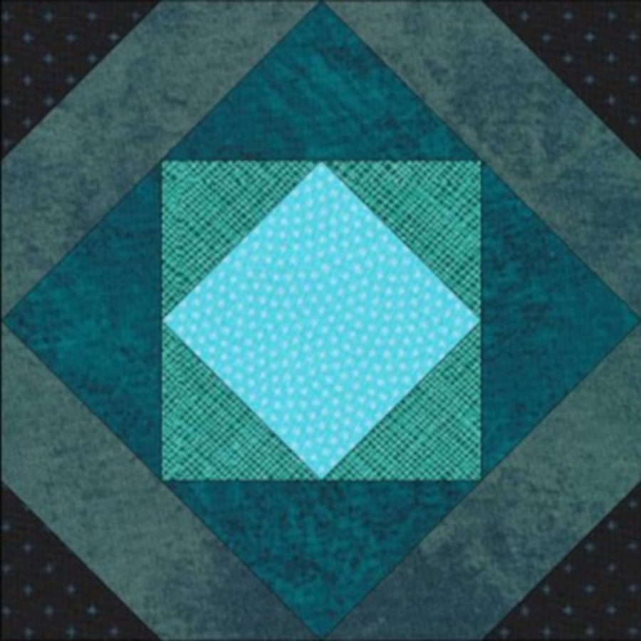
Luminosity is the illusion that light is glowing. The block above demonstrates the recipe – take a small amount of clear bright pure color and surround it with colors that get darker and grayer.
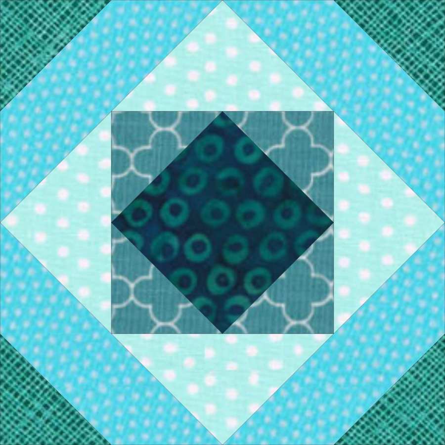
Here’s an example that does not create the illusion. The values (light vs dark) and intensity (pure or grayed) are mixed up.
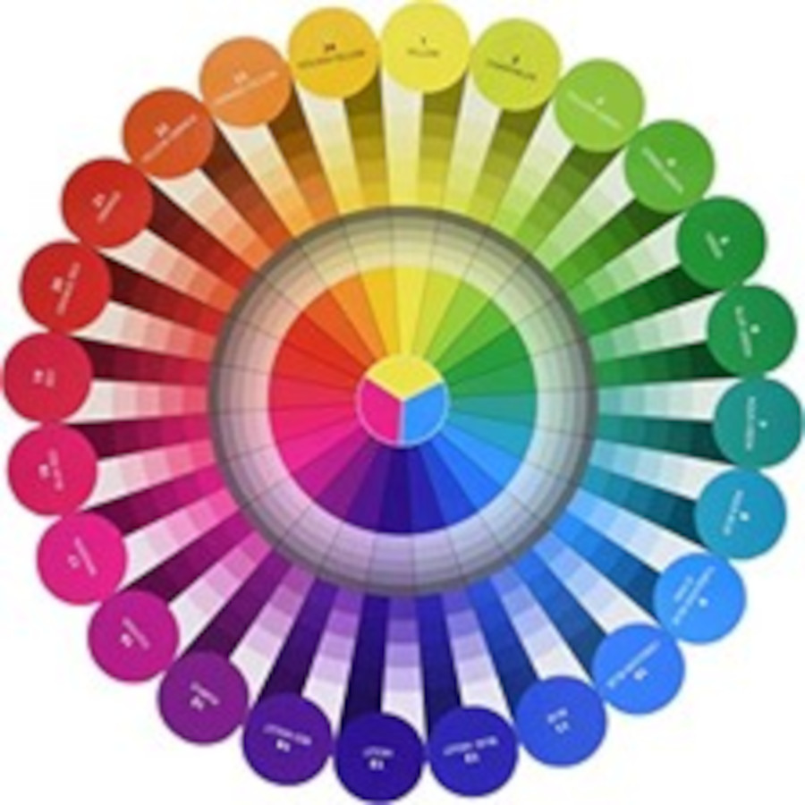
A color wheel is very useful to get everything in order – I recommend Joen Wolfrom’s Color Tool (available here) as the best for quilters. It has 24 different colors with a large range of values and examples of intensity (bright vs toned/grayed) gradations.
Putting it all together
Play with fabric and give this cool color effect a try! Here are some tips:
Take a photo and use the black and white filter to accurately see value.
- While it’s easier to create the effect within a single-color family (monochromatic), it can also be done with analogous colors, but be sure to keep in color wheel order.
- If you’re not seeing a glowing effect, decrease the amount of clear bright and get to the dark quicker.
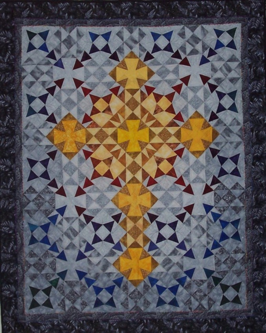
My quilt, Golden Cross (pattern available here), uses the effect of luminosity. Pure golds are surrounded by more toned (grayed) golds, and the background greys go from light to dark. Especially in a dim church, the pure yellow golds glow.
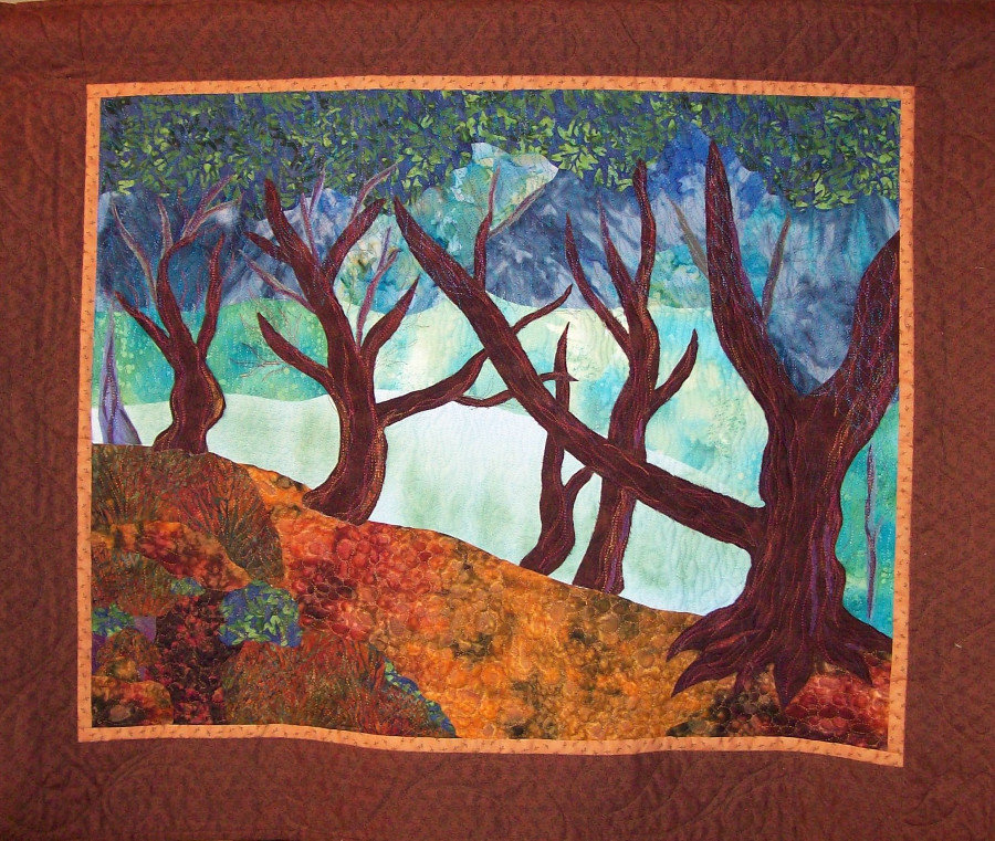
Here’s another quilt I made, based on a painting by Claude Monet. The bright center section is surrounded by progressively darker and grayer fabrics and it glows.
Jinny Beyer works a lot with luminosity as well as luster. See examples on her website, especially Windows and Wedding Quilt for Kiran and Rob. Note how she uses analogous colors as well.
Ask yourself – how could you incorporate luminosity into your next quilt?
I hope you’ve enjoyed this blog series on color effects. You might also enjoy my APQS blog post about choosing threads.