
Three Aspects of Color – Part 2: Intensity and Neutrals
Welcome to Part 2 of our “Three Aspects of Color” series, where we will explore the third aspect of color – intensity. Intensity represents how bright or muted a color is. If you missed Part 1, where we looked at Color/Hue and Value, you can read the article here.
When you understand how Hue, Value and Intensity work together, the more successful you will be. Each aspect helps determine which fabrics will demand attention and you can use this to emphasize different parts of your block and/or quilt. This is what we will explore in the third and final part of this series – putting it all together.
Intensity
When describing a color, most people would say the value and hue, such as “I’m wearing a light blue sweater with dark brown pants.” But most people don’t pay much attention to the intensity of a color – whether it’s bright or subdued, unless it’s neon bright or so grayed as to be nearly colorless.
Intensity is the least understood aspect of color. It refers to how bright (clear, pure) or toned (grayed, muted, subdued, dusty, muddy) a color is.
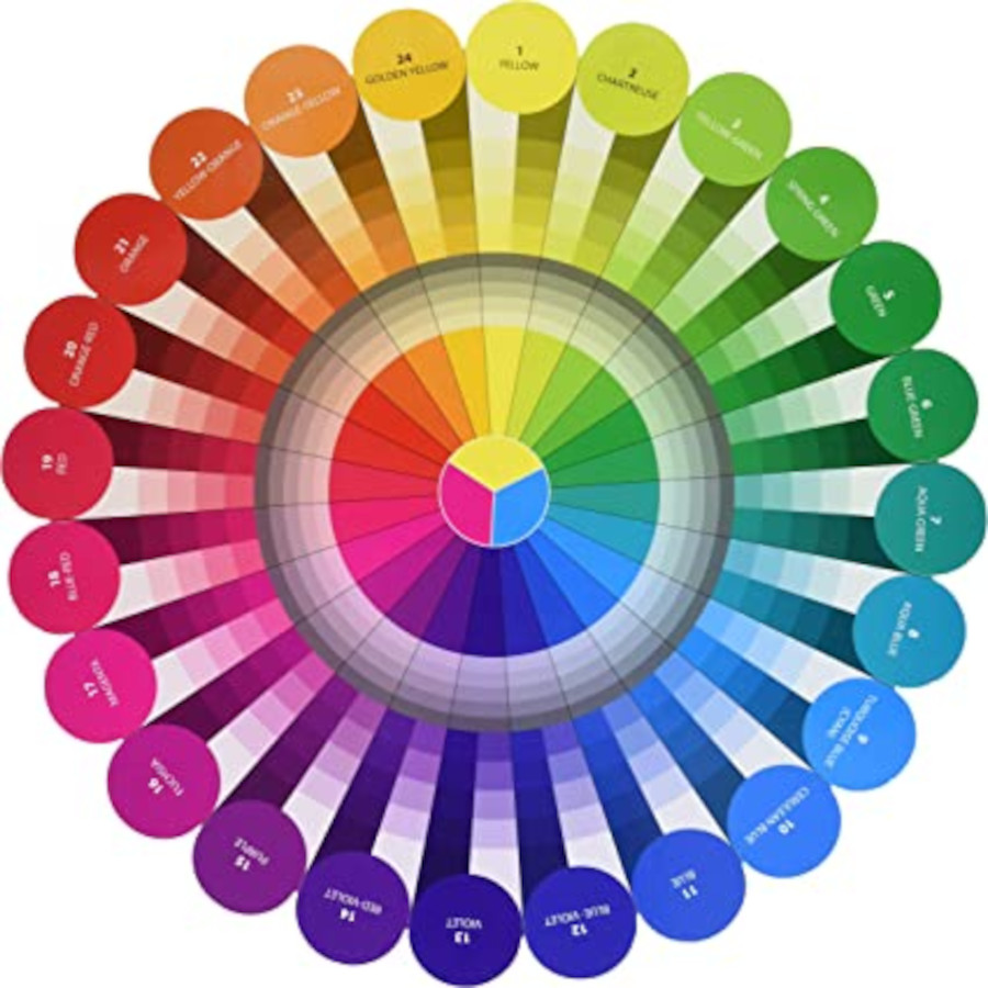
In the color wheel shown, by Joen Wolfrom, the pure bright color is along the outer ring and the innermost ring. The 2nd outermost ring reflects the value gradations – white is added to make the hue lighter (tint) and black is added to make the hue darker (shade). These are still pure variations of the hue, but the saturation is less, so the hue is not quite as strong as the pure outermost ring. I think of saturation as the “thickness” of the color – is it thick and bold, or thin and watery/diluted? But when BOTH white and black are added (gray), this creates a toned version of the hue. This can vary from lightly grayed to gray with a hint of color hue. Toned fabrics can come in any value (light, medium or dark).
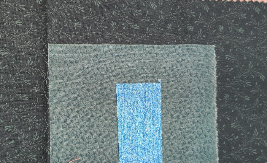
Just like nearly everyone has a preferred color hue, almost everyone has a preferred level of intensity. Some like really bright colors (bottom of the image below) while others like more subdued-toned fabrics (top), like Civil War fabrics or 1980’s dusty rose hues, and others are somewhere in between.
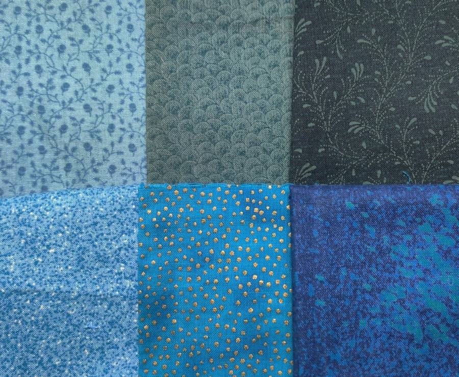
Grayed/toned vs bright/pure
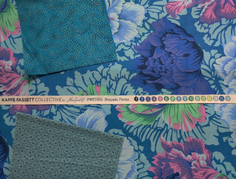
Many quilters shy away from very toned, grayed colors. But these toned colors have a superpower! Because they contrast with the bright pure colors, they help the pure colors look even brighter. Bright colors next to bright colors compete with each other so neither looks as bright as it would on its own. Some designers are known for their bright palettes, like Kaffe Fassett. If you look at the dye marks on the selvedge there are often toned colors along with the bright colors that help put the focus on these bright colors.
It can be a challenge to recognize pure vs toned colors. I really like Joen Wolfrom’s Color Tool to help me with this. In the color sample below, the left side has the pure color in a gradation from very light to very dark. On the right side are toned versions of a few of the colors in a range of tone – from lightly grayed to heavily grayed.
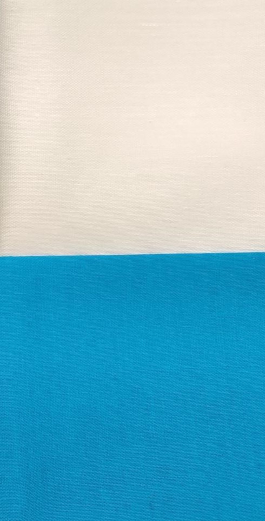
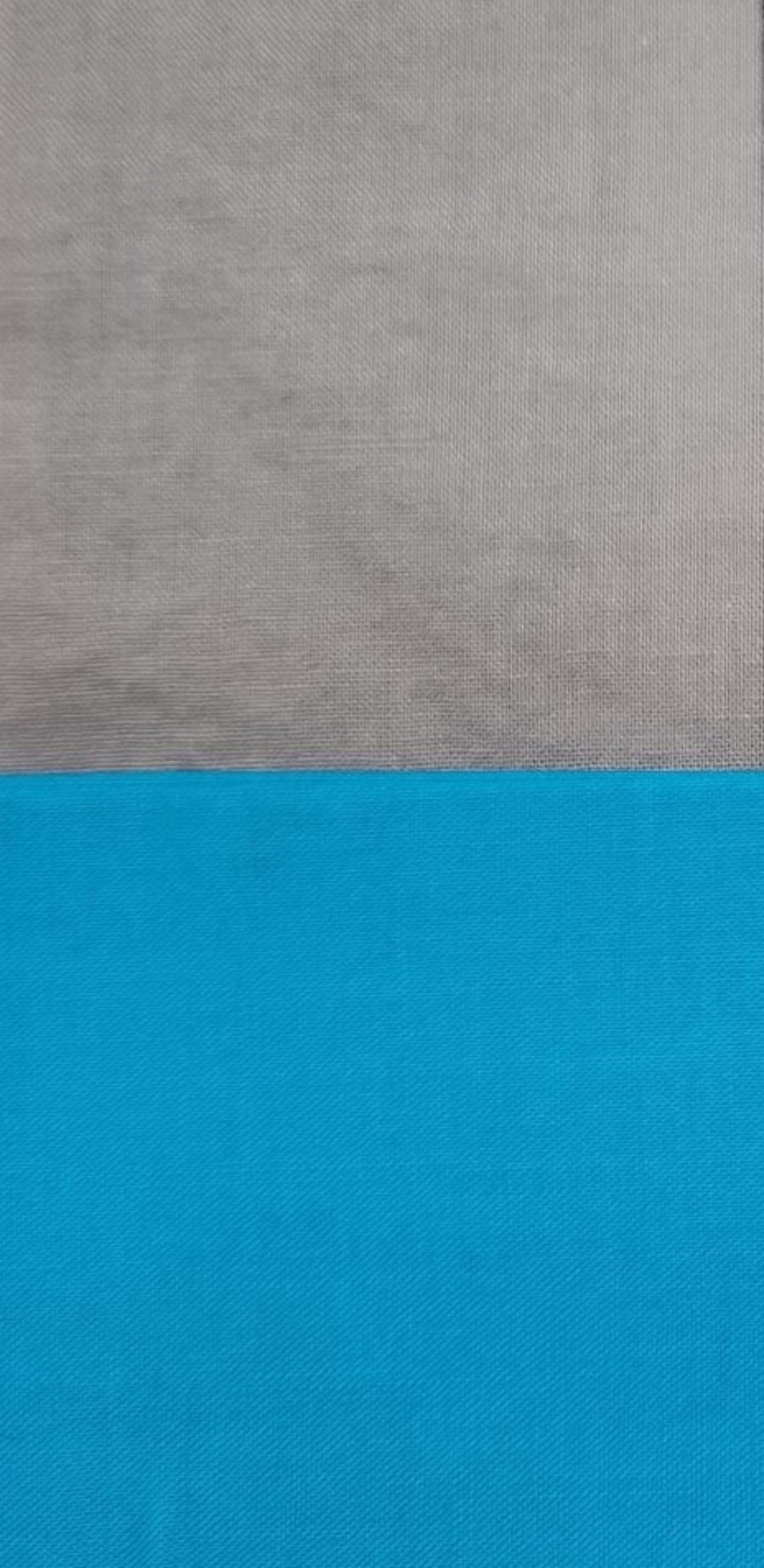
Toned colors are also critical to creating luminosity, which is the illusion of colors that glow. This is created by placing a small amount of a pure color next to progressively toned and darker colors. This contrast of both intensity and value creates a glowing effect.
Luminosity
Just like warm or dark colors advance and cool or light colors recede, pure colors advance and toned colors recede. A phrase my mother used to use when we kids were too loud, was to “tone it down.” Think about what aspect of your quilt you want to stand out. Use the (comparatively) brightest fabrics in these spots.
Neutrals
Neutrals are achromatic, meaning they have no color. These are the whites, grays and blacks and are not on the color wheel. They have value and intensity, but no hue. Quilters will also use cream as a neutral, but cream is usually a very pale-toned orange or yellow. The important role of neutrals is to help focus attention on the colors and are wonderful for providing a place for the eye to rest.
Adding neutrals does not change your color scheme, but it can lighten or darken your block or quilt depending on the value of the neutrals you are using. Using pure white as a background will compete with bright colors and soften them. Using gray as a background will make the bright colors brighter and using black will make the bright colors really pop. It’s all a matter of contrast.

Your turn
Take a bright fabric and put it next to a very toned fabric, then put the bright fabric next to another bright fabric. Does the first bright fabric look brighter or more subdued in each situation?
Pull out a multicolor fabric that has lots of bright colors. Look along the selvedge at the dye dots. Are there any toned colors?
Take a look at your fabric stash. Do you have a preponderance of bright colors? Or more subdued, toned fabrics? Pull out fabrics with a range of intensities (bright to grayed). Which level of intensity resonates with you the most? Leave a comment in the Comment Section – I would love to hear from you!
Coming up in part 3
Join me in Part 3 where we’ll put it all together and see how we can use all three aspects of color to create the desired effect. Playing with color is such a joy – get out your favorite fabrics and identify the aspects of color at play in each of them. A color wheel is extremely helpful. I recommend Joen Wolfrom’s Color Tool and/or Color Wheels, available at my website shop. If you’ve enjoyed this blog about color, you might also enjoy my APQS blog post about choosing threads, based on many of the same concepts.