
Three Aspects of Color in longarm quilting – Part 1: Hue and Value
Most of us learned our colors in preschool, right? Then why do so many quilters have trouble picking fabrics for a quilt?
I have taught many quilters about color in my classes and lectures, and the little-known secret about color is that there are three aspects of color – hue, value and intensity. When you understand how they work together, the more successful you will be. You will better understand which of your fabrics will demand attention and use this to emphasize different parts of your block and/or quilt.
So welcome to this three-part series on color:
- Part 1 will cover Hue and Value.
- Part 2 will take a closer look at Intensity and Neutrals.
- Part 3 will put it all together and we’ll look at how this can help you pick fabrics for your quilt.
Color and hue
We all know our crayon box colors – yellow, blue, red, etc. And if you’ve ever stood in the paint aisle looking at color chips, you know that there are many colors in between. That “family” of colors is the hue.
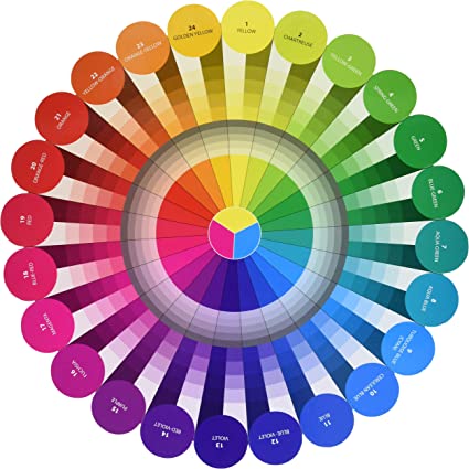
In the color wheel, this is the pure color along the outer ring. This color wheel has 24 divisions of color and is by Joen Wolfrom. When I use this color wheel, instead of one with only 12 colors, there is a smoother transition between colors and I can readily categorize nearly every fabric in my stash into one of these 24 color families.
For example, if you have a 12-step color wheel and try to find pink, it’s probably not there. But Pink is not a light version of red. In Joen’s color wheel, I readily see pink is magenta – between red and purple.
Our reaction to color hue is emotional. Nearly everyone has colors that resonate with them, and other colors, not so much. Some people actively dislike certain colors. Blue consistently rates high as a favorite color; orange not so much.
One thing about color hues that is nearly universal, is that warm color hues (yellow, orange, red) tend to stand out – they have energy. On the other hand, cool color hues (green, blue, violet) tend to recede (be in the background) – they are calmer.
This is critical for quilters to understand because so much of quilting design depends on contrast and what stands out. “A little bit of yellow goes a long way” is a quilting truism – yellow is definitely an attention-grabbing color. “Shrinking violets” is also a truism for violet’s propensity to hang back. Using both warm and cool colors in a quilt will provide color hue contrast.
Cool colors:
Warm colors:
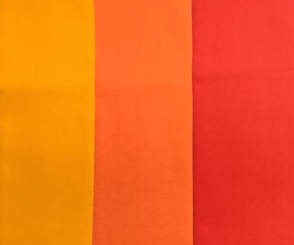
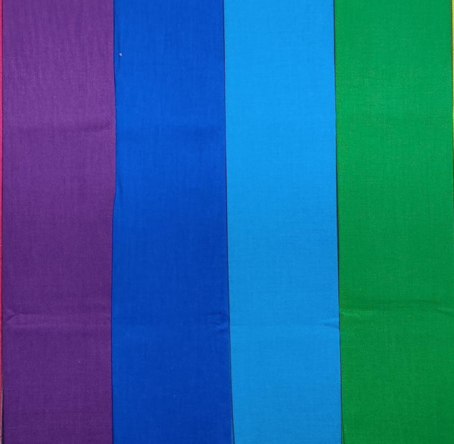
Color temperature is relative in that it depends on the other fabrics it is next to. A chartreuse (yellow green) might be the warmest color next to blue and purple but will be the coolest color next to yellow and orange.
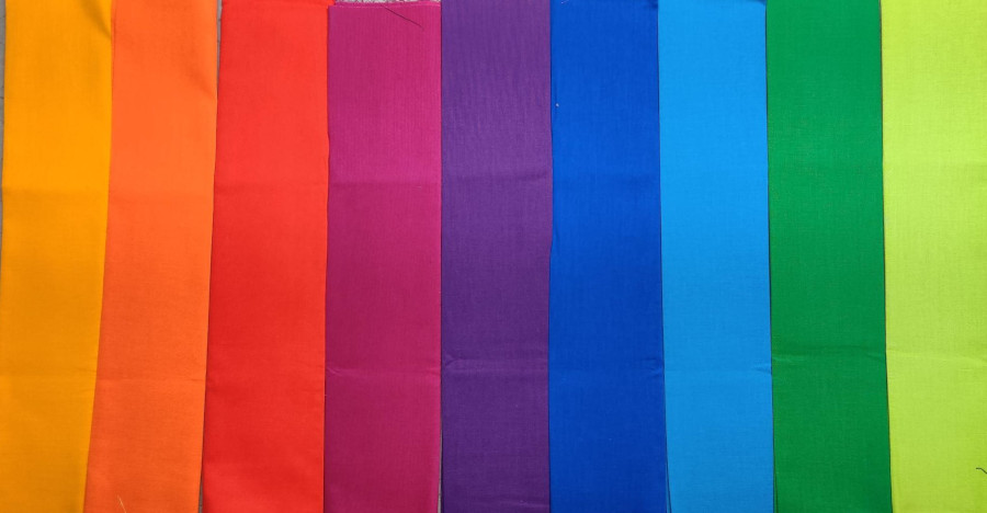
In this image, chartreuse is the warmest:
In this image, chartreuse is the coolest.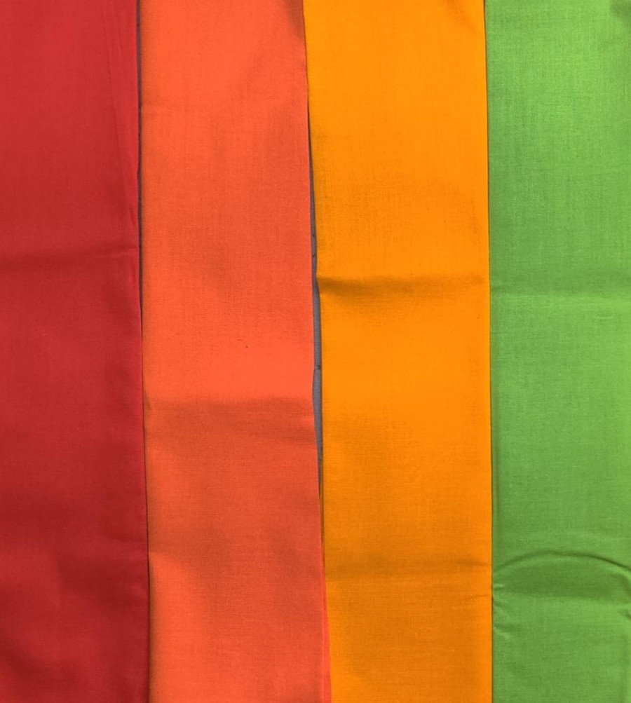
Value (light vs dark)
Value is whether a color is light (white is added to make a tint), medium (pure) or dark (black is added to make a shade).
In the color wheel, the light and dark value gradations are underneath each medium pure color hue. Value contrast is the strongest possible contrast there is – even more powerful than color contrast.
“Color gets the credit, but value does the work” is a quilting truism. When you see a quilt with great colors, the maker has probably used great value contrast. A quilt with a full range of light to dark fabrics will be more dramatic and interesting than one with similar values, which will be softer and calmer.
As certain hues get darker, they transform into colors so different we have specific names for them. For example – where is brown? It’s usually a dark orange, but there can be undertones of many different hues in various browns. What color is dark yellow? When black is added to pure yellow, it turns an olive green. And as soon as blue is added to yellow, we definitely see it as green. This is why there is so little relative variation in yellow compared to the broad spectrum of greens.
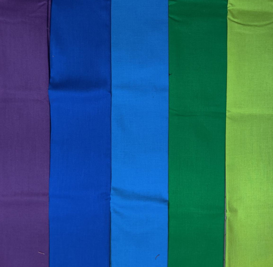
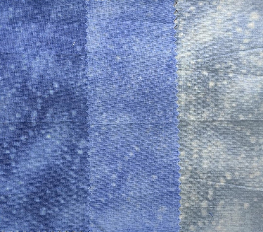
Value is relative! A medium color might read light next to darks and dark next to lights. In this image, medium blue is dark against lights.
In this image, medium blue is light against darks: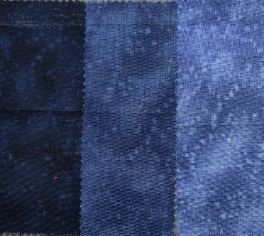
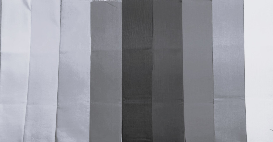
Each hue also has a relative value. If you line up the pure medium values of each color and turn it to black and white, you can see the difference. In the photos below, you can see that the yellow and yellow-green have the lightest values, and the violets and blues have the darkest.
Here’s a look at the range of pure colors:
Black and white shows the value:
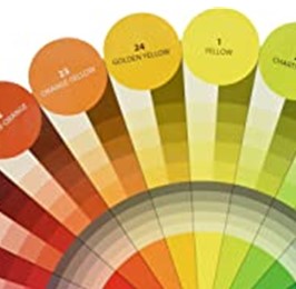
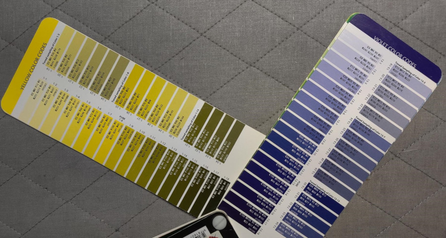
In Joen Wolfrom’s Color Tool, she shows value gradations for each color. In the photo of the Color Tool, you can see that the pure Yellow is value gradation 8, but the pure Violet is value gradation 13. This tool is wonderful for helping to judge relative value between colors.
In general, dark colors advance and light colors recede. One exception to this is a small amount of light amongst a lot of dark. Most quilters use a light fabric, such as white or cream as the background in their blocks because it recedes. Fabrics with a similar value will look “mushy” – the fabrics merge together and it’s hard to see the piecing.
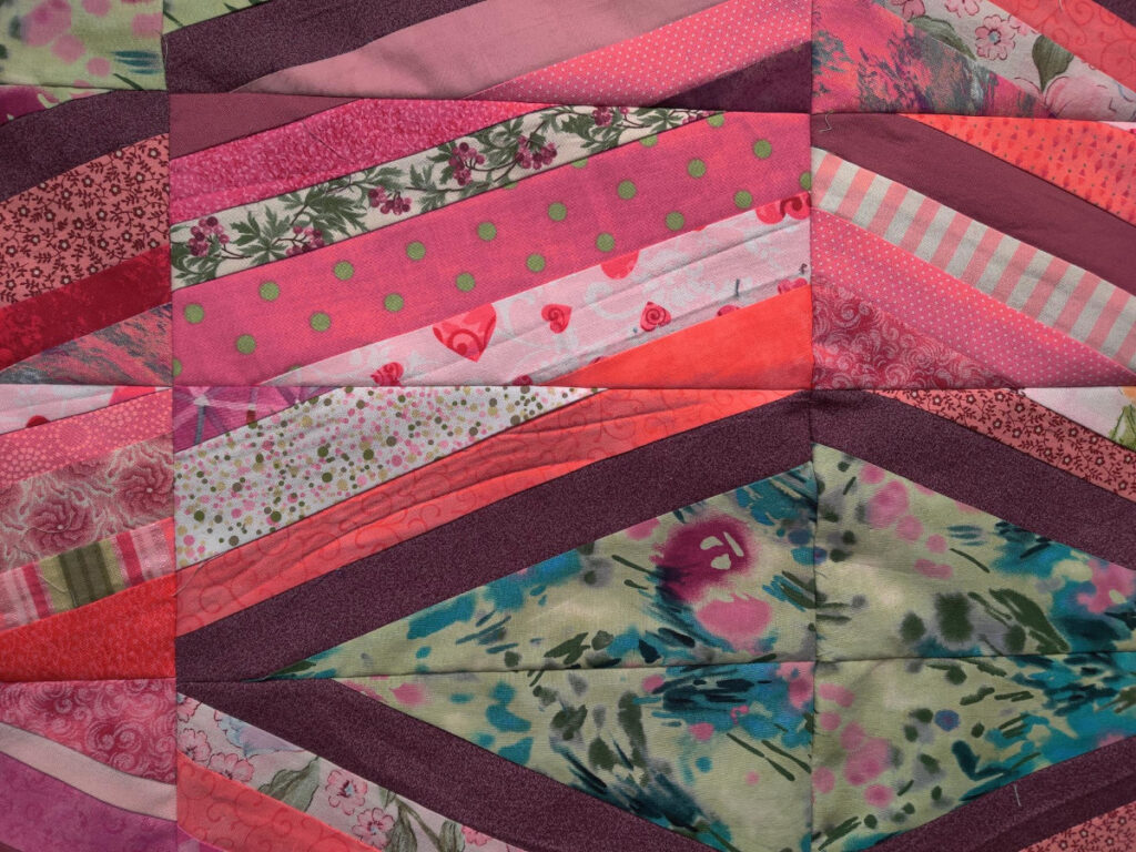
In the string piecing example below, many different fabrics and values were used. When the values are similar, they merge together. When dissimilar, the contrast stands out, and the dark strips stand out the most.
When planning your quilt or block, think about where you want the viewer to focus, or what parts of the block you want to emphasize; this is where you need to put the most value contrast.
Your turn
Take a look at your quilts or photos – what do you notice first? What colors are they? Is there strong value contrast? What demands your attention and what do you hardly notice? Do you have a favorite color for quilts? Do you have your stash organized by color hue and/or value? Leave a comment in the comment section –we would love to hear from you!
Coming up in part 2
Join me in Part 2 where we’ll explore Intensity – how bright or muted a color is, and the essential Neutrals, which have no color. Playing with color is such a joy – get out your favorite fabrics and identify the aspects of color at play in each of them. A color wheel is extremely helpful. I recommend Joen Wolfrom’s Color Tool and/or Color Wheels, available at my website shop.
If you’ve enjoyed this blog about color, you might also enjoy my APQS blog post about choosing threads, based on many of the same concepts.