
Three Aspects of Color – Part 3: Putting it all together
Welcome to Part 3 of our series “Three Aspects of Color.” In this article we will put it all together and explore how to successfully select colors and fabrics for our quilts. If you missed Part 1, where we looked at Color/Hue and Value, read the article here. You will find Part 2 about Intensity and Neutrals here.
Picking fabrics for a quilt
What do color choices ultimately mean for us when picking fabrics for a block/quilt? We can use the three aspects of color (hue, value and intensity) to help us predict which fabrics will stand out, draw attention and ensure this is what we want. Here are a few different ways you can go about picking a palette for your quilt:
Think of the quilt recipient
You can think of the intended recipient of the quilt and their favorite color(s). Might they like bright crayon colors? Or more serious, darker or toned colors? Or softer floral colors? Once you have an idea of color and intensity preference, you can select other colors that go well with the focus color.
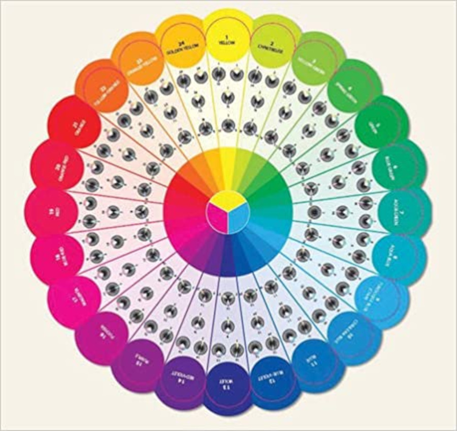
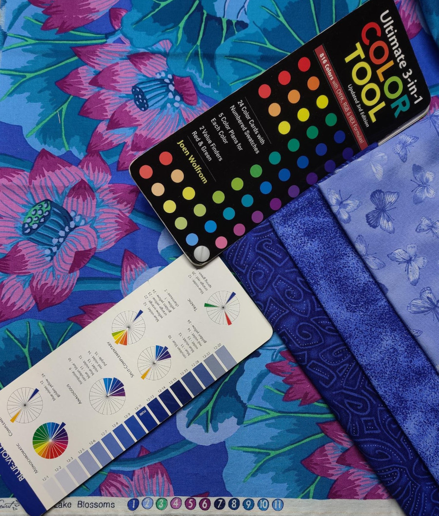
Generally, successful combinations can be found with any good color wheel, such as analogous, triadic or complementary. Joen Wolfrom’s Color Tool (available from my website) includes these for each color.
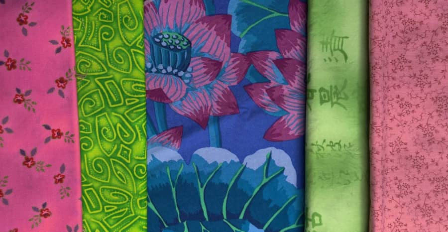
Find a beautiful fabric with colors you love
Look at the selvedge to find the colors used in the fabric. You don’t need to match a color or value exactly but do stay in the color family. Take a look at the proportion of each color and the intensity. This technique also works with photographs, but you won’t have the selvedge to help identify the colors. Look closely for the toned colors in photos – these are often overlooked but play a vital role!
Here are some fabrics I pulled to go with a focus fabric. In the example below, I’ve pulled fabrics that are blue-violet (like the background) in light, medium and dark, and they blend beautifully.
Think of a mood or theme
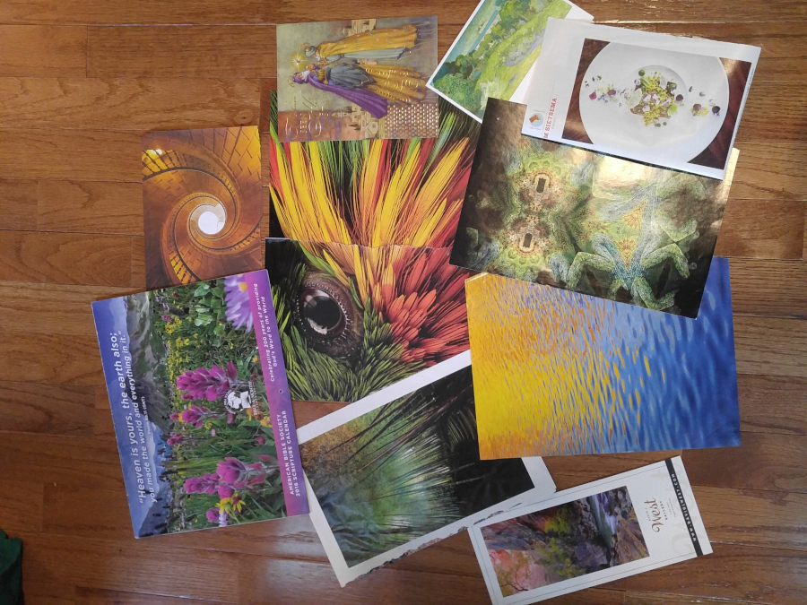
Misty water, warm beach, orange sherbet, winter night – and which colors fit into this? Decorating magazines are great for showcasing colors that fit a theme. I keep an inspiration file of interesting color combinations – see some of them below. When a certain combination appears over and over, I know it’s one I want to explore.
Look at your pattern
- Are there parts of the block/quilt you want to emphasize? This is the place for a diva – warm, pure and/or medium/dark.
- Are there parts you want to hang back/recede? This is the place for supporting characters – cool, toned and/or light/medium. Neutral creams and grays will generally recede.
- What about sashing and borders? The same rules apply. Do you want these to stand out or be in a supporting role?
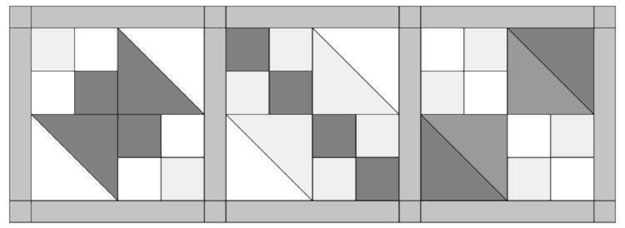
- The picture below shows the same block, but in each case, a different value is used to emphasize different parts of the block. The dark portion is the diva here and stands out.
- Make sure you use the diva where you want the design to stand out. The lighter portions hang back.
Look at your chosen fabrics. Which fabrics will best play each role?
- Which of your fabrics are warm vs cool? Light vs medium vs dark? Pure vs toned (grayed)?
- Any warm, pure and medium/dark fabrics will definitely stand out. These are your divas and should be where you want the emphasis. Are there too many divas and they will all fight for attention?
- Any cool, toned and light/medium fabrics will recede and be your chorus – the supporting characters that make the divas look good. Do you have enough of them? You will need more of these to visually balance the divas. The proportion of each color is important to get balance.
- If you want to emphasize a fabric that is not warm, pure and/or medium/dark, that’s fine – just make sure your supporting fabrics are not warmer/purer/darker than this fabric; otherwise, the supporting fabrics just might steal the show! In the sample below, the brighter fabrics on the left are overpowering the muted tones in my focus fabric. But the softer, less intense versions of the supporting fabrics on the right blend in better and shift the attention to the focus fabric.
- What about fabrics that have a mix? They are warm and toned. Or cool and bright. Lay the fabrics next to each other. Are they playing nicely by providing enough contrast to help the diva shine or are they fighting with the diva for dominance?
- If you have a warm palette or a cool palette, then the temperature will be less of a factor and value and intensity will be more important.
- Think about the role assigned to each fabric in the quilt and use the aspects of color to make sure you’ve got round pegs in round holes.
Working with color can be a challenge, but you will get better with practice and every quilt you make!
Play around with pulling fabric to create potential palettes for quilts using one of the ideas above. Do you like the colors together? Do you have enough value contrast (light vs dark)? Don’t use all medium values; your subject is sure to get muted or lost. Which fabric(s) stand out?
Keep an inspiration file of interesting color combinations. I find a color wheel is extremely helpful. I recommend Joen Wolfrom’s Color Tool, available on my website. If you’ve enjoyed this blog about color, you might also enjoy my APQS blog post about choosing threads, which is based on many of the same concepts.