
Achieving color illusion in longarm quilting – Part 1: Transparency
Color illusions have the power to elevate your quilt to a whole new level, creating mesmerizing effects that captivate the eye. Whether it’s playing with transparency, creating the illusion of light and movement or adding a radiant glow, there are endless possibilities to explore.
Welcome to this three-part series on color illusions where we will cover
- Transparency
- Luster
- Luminosity
If you are new to color, you may want to review the APQS blog series on color:
When we create transparency with fabric, we’re creating the illusion that we’ve overlapped two fabrics and seeing a blend of the two fabrics, when in fact we’ve used three fabrics.
In the block above, it looks like I have overlaid the lightest blue (square) over the royal blue (set on point) and I’m seeing the colors blended in the medium blue where they overlap. But the colors aren’t really blending – I’ve actually used a third fabric of medium blue.
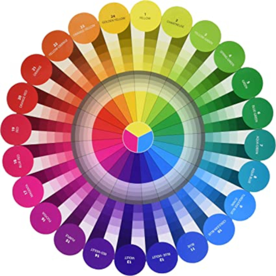
Believe it or not, this effect is easy to achieve as long as you have the correct recipe based on the relationship between the two colors you’ve chosen to be “mixed.” Are they monochromatic, analogous, complementary or farther away than a triad but not quite complementary?
If you want a refresher on these terms, read this APQS blog on Color by Dawn Cavanaugh. A color wheel will also be very useful to see these relationships – I recommend Joen Wolfrom’s Color Wheel and/or Color Tool (available from my website) as the best for quilters to use.
Here are four approaches you can use to achieve transparency for your color illusion:
Monochromatic
Monochromatic is literally one (mono) color (chroma) in a range of values (light, medium and dark). In this case, you need to have the middle value (medium) in the middle with the light and dark fabrics on either side.
Notice in the images below that when the medium value is in the middle, it looks like there are two blue fabrics, with the light and dark fabrics overlapping. But when the dark is in the middle, it looks like three different fabrics. If the light was in the middle, it would also look like three different fabrics.
Transparent – medium in middle
Not Transparent – medium on outside
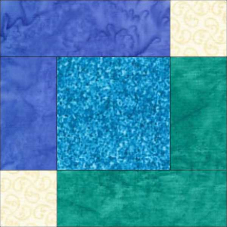
Analogous
Analogous colors are colors that are next to or near each other on the color wheel. Think analogy – similar or like.
Analogous colors are similar to each other because they share at least one primary color. If I were mixing paint, this middle color is what the paint would mix as. In the example below, I’ve used blue and aqua green for the outside colors and turquoise in the middle. Keep your colors in color wheel order with the middle color in the middle.
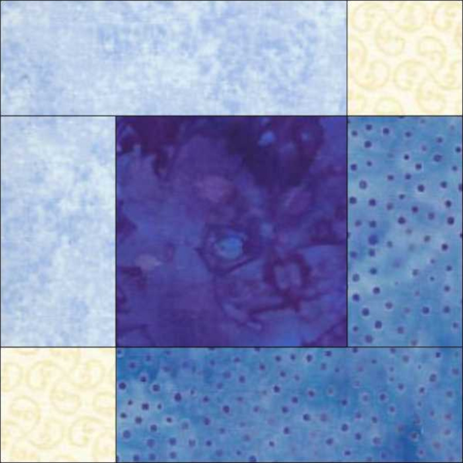
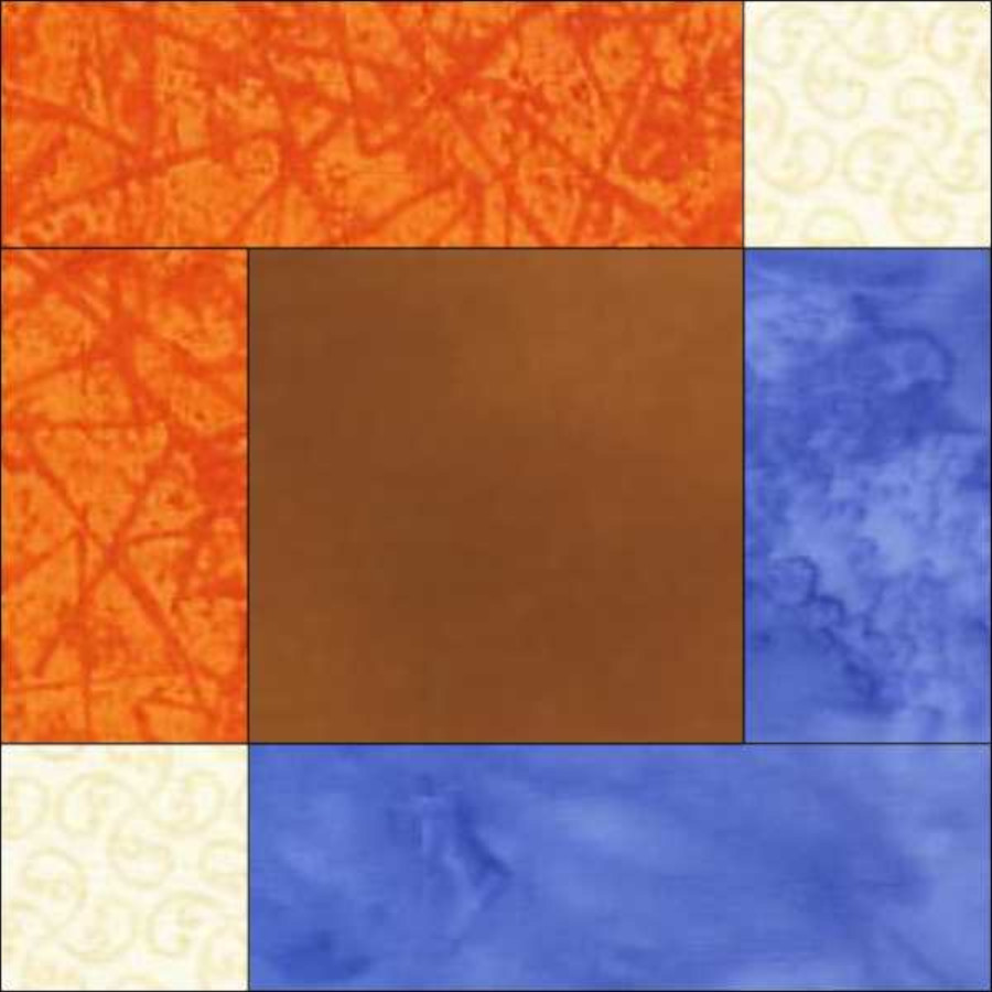
Complementary
Complementary colors are opposite on the color wheel. Again, a color wheel, especially one divided into 24 different colors like Joen Wolfrom’s, is very handy. If I were mixing paint, complementary colors would make a muddy brown. In the example below, I’ve used orange yellow and blue for the outside colors and a muddy brown in the middle.
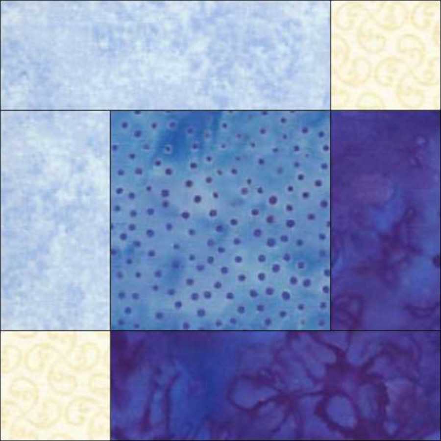
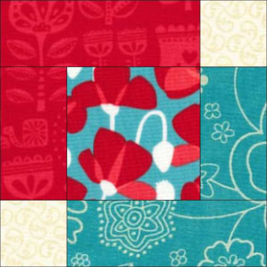
Two-color approach
For colors that are at least two of the colors of a triad (three colors that are equally spaced apart) but not quite as far apart as a complementary, you can use the two-color approach, where you find a fabric that combines both the other two colors. In a 24-color wheel, these are colors that are 8-11 colors apart. In the example below, I have red and turquoise for the outside colors and a fabric that contains both colors for the middle.
Putting it all together
Playing with fabrics and colors to create cool color effects is so much fun. Here are some tips to create the illusion of transparency:
- Use your color wheel to get to the right color family for the fabric in the middle.
- Look at the values (light or dark) and intensities (bright or grayed/toned). The middle fabric should be in between the values of the outer fabrics and in between the intensities of the outer fabrics. For example, if your outer fabrics are medium and dark, the middle fabric should be medium dark. If your outer fabrics are bright and grayed/toned, your middle fabric should be slightly toned – not as bright as the bright fabric, but brighter than the grayed/toned fabric.
- Remember that you’re not looking for the prettiest fabric for the middle fabric, but the fabric that helps the illusion the best. You will probably need to experiment with multiple fabrics to get this right.
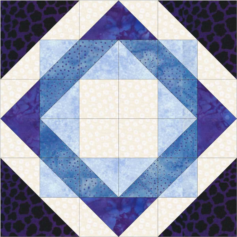
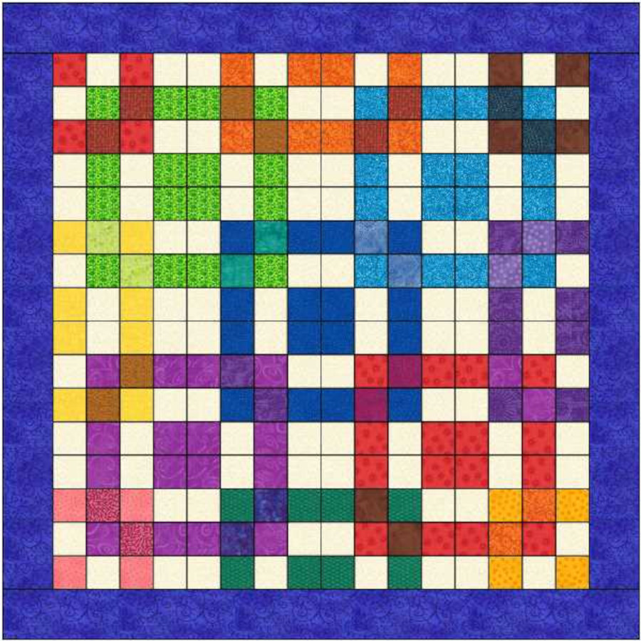
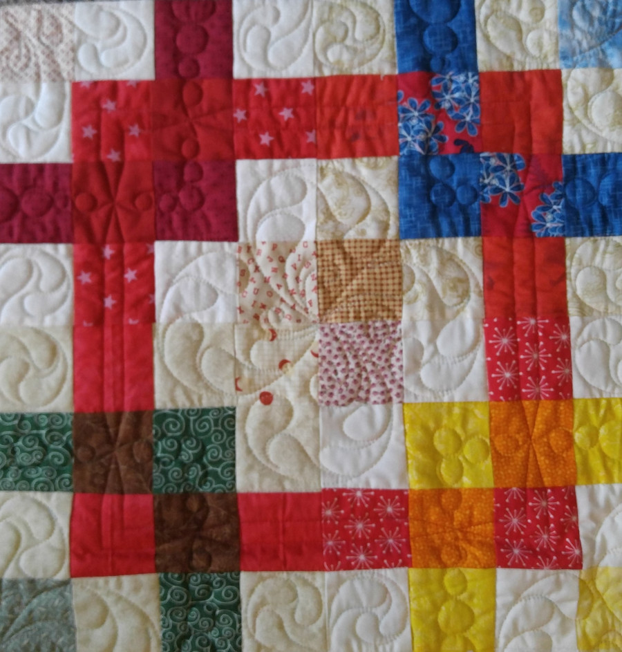
Here’s an example of a quilt pattern (available from my website) that uses the principle of transparency.
Your turn
Take a look at other blocks – how could you incorporate transparency into your next quilt? Leave a comment in the comment section –we would love to hear from you!
Coming up in Part 2
Join me in Part 2 where we’ll explore Luster – the illusion of light moving across the quilt.
If you’ve enjoyed this blog about color, you might also enjoy my APQS blog post about choosing threads.