
Three Aspects of Color series
Have you struggled with picking fabrics that complement your quilt? Here’s a little-known secret about color that will change the way you pick colors for your projects: hue, value and intensity. Once you understand how these aspects of color work together, the more successful you will be in picking colors for your quilt that truly work. You’ll be able to easily determine which fabrics demand attention and use them to emphasize different parts of your block and/or quilt.
Hue and value
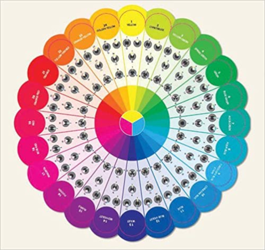 Understanding the hue and value of colors will help form a better understanding of what colors will stand out in a quilting design. A quilt with a full range of light to dark fabrics will be more dramatic and interesting than one with similar values, which will be softer and calmer. To learn more about hue and value, read part 1 in our series: Three Aspects of color in longarm quilting – Part 1: Hue and value
Color intensity and neutrals
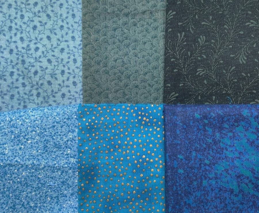
Color intensity will help you determine which fabrics complement each other, making fabric selection a breeze! This blog post explains what color intensity is and how it applies to picking fabrics for your quilts: Three aspects of color – Part 2: Intensity and neutrals
Putting it all together
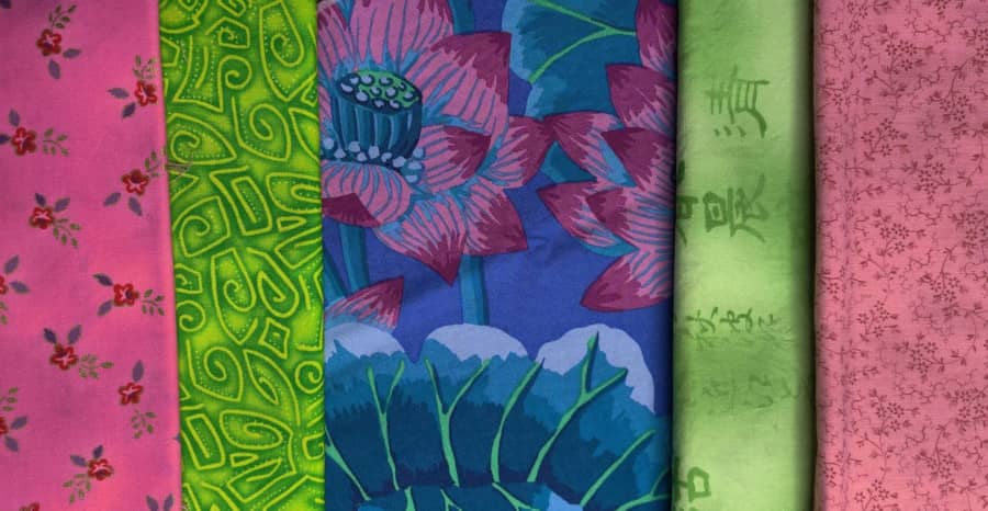
After you’ve considered the color hue, value and intensity – it’s time to pull it all together! In this article we explain how to pick fabrics to go along with the color palette of your quilt: Three aspects of color – Part 3: Putting it all together
Working with color can be a challenge, but you will get better with practice and every quilt you make! If you’ve enjoyed this series about color, you might also enjoy the APQS blog post about choosing threads, which is based on many of the same concepts. Happy quilting!