
Quick Quilt Top series – help us pick a quilting design
The results are in! Here’s the top vote getter from the 10 different Drunkard’s Path layouts we shared from our first post in our new Quick Quilt Series. (Did you miss that post? Though voting for your favorite is closed, you can still check out all the contenders by clicking here.) Design 7 came out at the top of the heap.
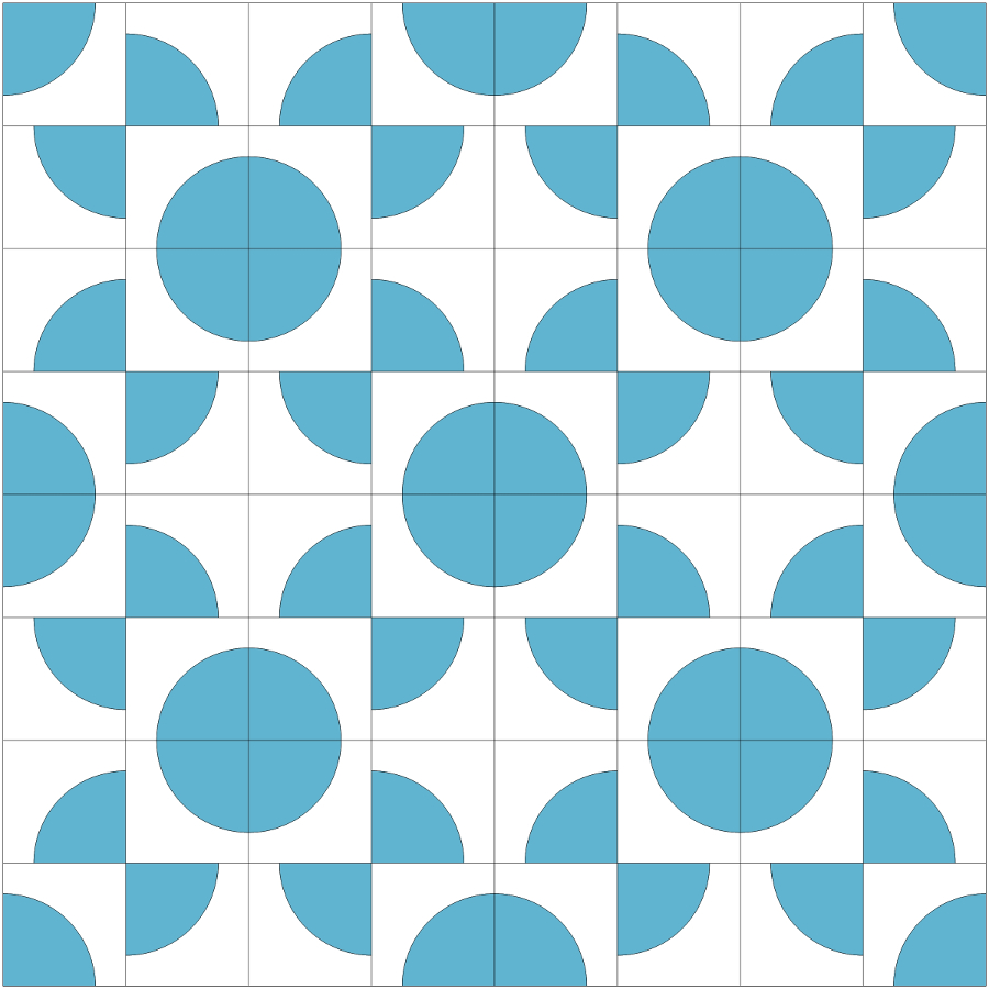
Even though it’s still winter, many of you must be suffering from spring fever because you commented that this layout reminded you of a lovely bouquet of springtime flowers! Nearly a thousand people chose that design—almost twice as many as the second-place finisher, Design 5 shown below. Funny, my eyes see a big, flowering blossom in Design 5—almost like one of the popular “Dream Big” digital panels by Hoffman Fabrics! I think I’ll have to piece that design from some cool ombre fabrics and give it life!
And speaking of fabric, several readers offered suggestions on what the color palette or fabrics should be for the winning design. Bright batiks were a popular pick, along with suggestions to try some vibrant Kaffe Fassett florals as a focus fabric. With so many possibilities and colors of the rainbow, it’s a tough decision!
I know you’re anxious and excited to see what quilt fabric I’ve chosen, but I’m going to keep you guessing for one more post. Why? Because one question that comes up over and over in my classes is “How do you choose quilting designs?” Until someone comes up with an app for that, I’ve found that some of my best quilting ideas come from looking at a quilt’s layout without the influence of fabric patterns and colors.
When I’m brainstorming a quilting plan, I often use a line drawing of my quilts with only dark and light patches filled in. This removes constraints that can interfere with creativity. When I’m not distracted by color, value, or the fabric print, I can design with abandon! I’m not visually constricted with staying inside seam lines. If I want, I can let the quilting spill over backgrounds as well as colored patches, creating a secondary design that can add depth and dimension.
That doesn’t mean that all my ideas are good. By the time I’m done playing, my ‘circular file’ is usually overflowing with rejects. But it helps me think outside that infamous “box” first.
It’s time for YOU to help figure out which quilting designs below won’t make the cut! Vote for your favorite below.
Layout #1
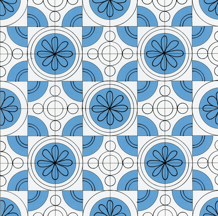
The first layout brings some whimsy to the design by adding daisy petals in the large circles and echoing those circles to resemble a flower center. It would be great for Kaffe and batik fans, since those busy fabrics often don’t show the quilting very well.
Layout #2
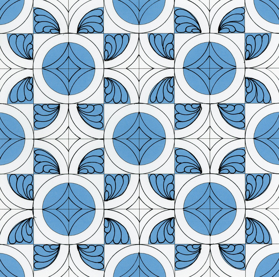
The second layout speaks to quilters who prefer more traditional fabrics and quilting designs. The feathers gracefully fill up the imaginary flower petals. And the interlocking circle designs form a pattern closely resembling a double wedding ring quilt.
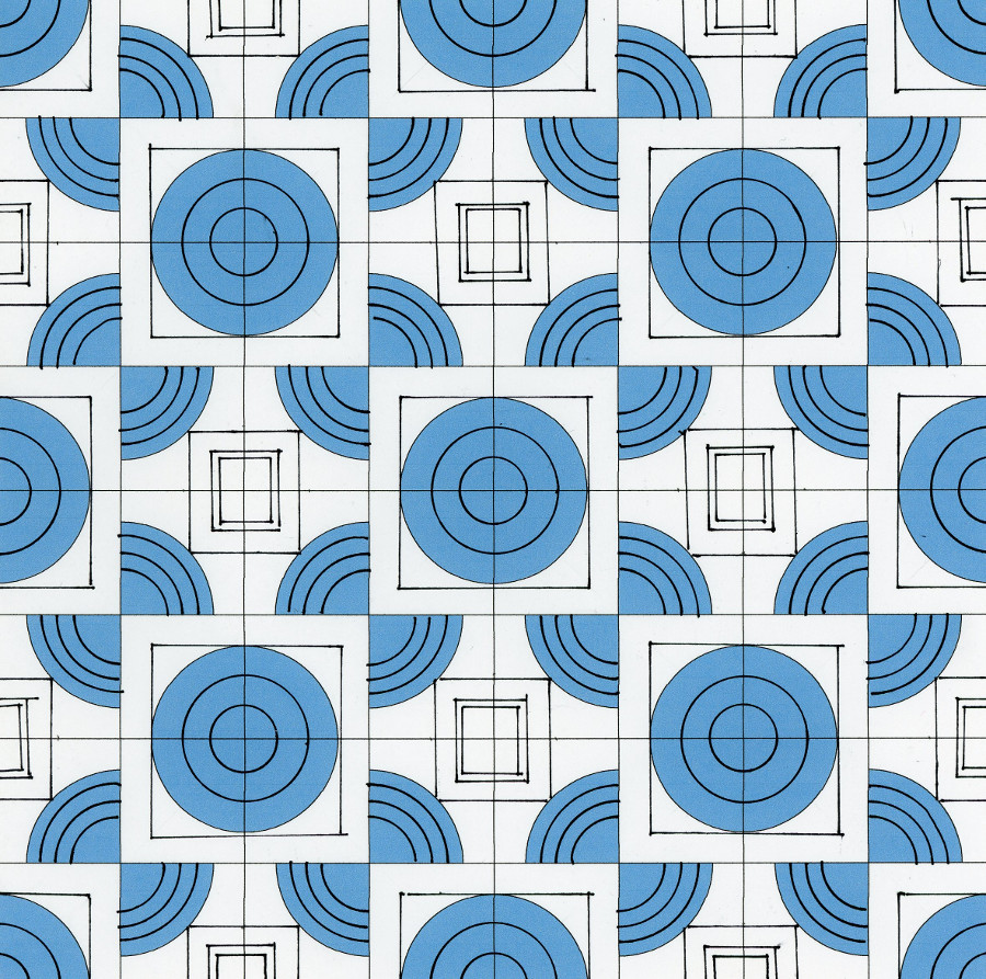
Layout #3
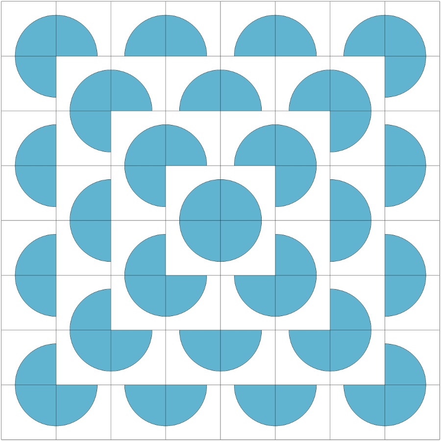
The last layout has a contemporary flavor. This design creates the illusion of depth—notice how the circles and the boxes around them look like they’re floating on top of the partial circles?
You won’t get to see my fabric choices until our next post, so you can choose a design that tickles your toes without worrying whether it will ‘work’ with the quilt or not—it will be a surprise!
Once we’ve tallied the votes, I’ll get to work quilting the quilt with the winning quilting design and then debut the final project in a new post, along with tips and tricks on how to make your own drunkard’s path quilt. Then we’ll give the quilt away to one lucky winner, along with a gift basket full of quilting goodies, courtesy of APQS!
Voting is now closed. Stay tuned for results…