
Free quilt pattern: Luscious Luster
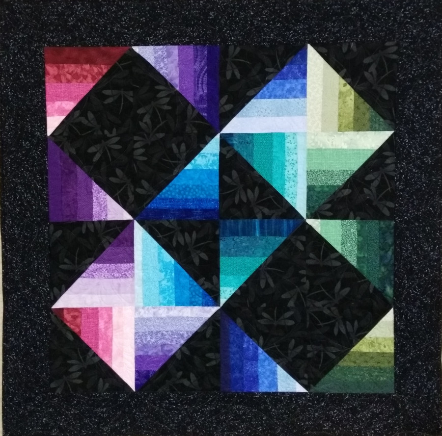
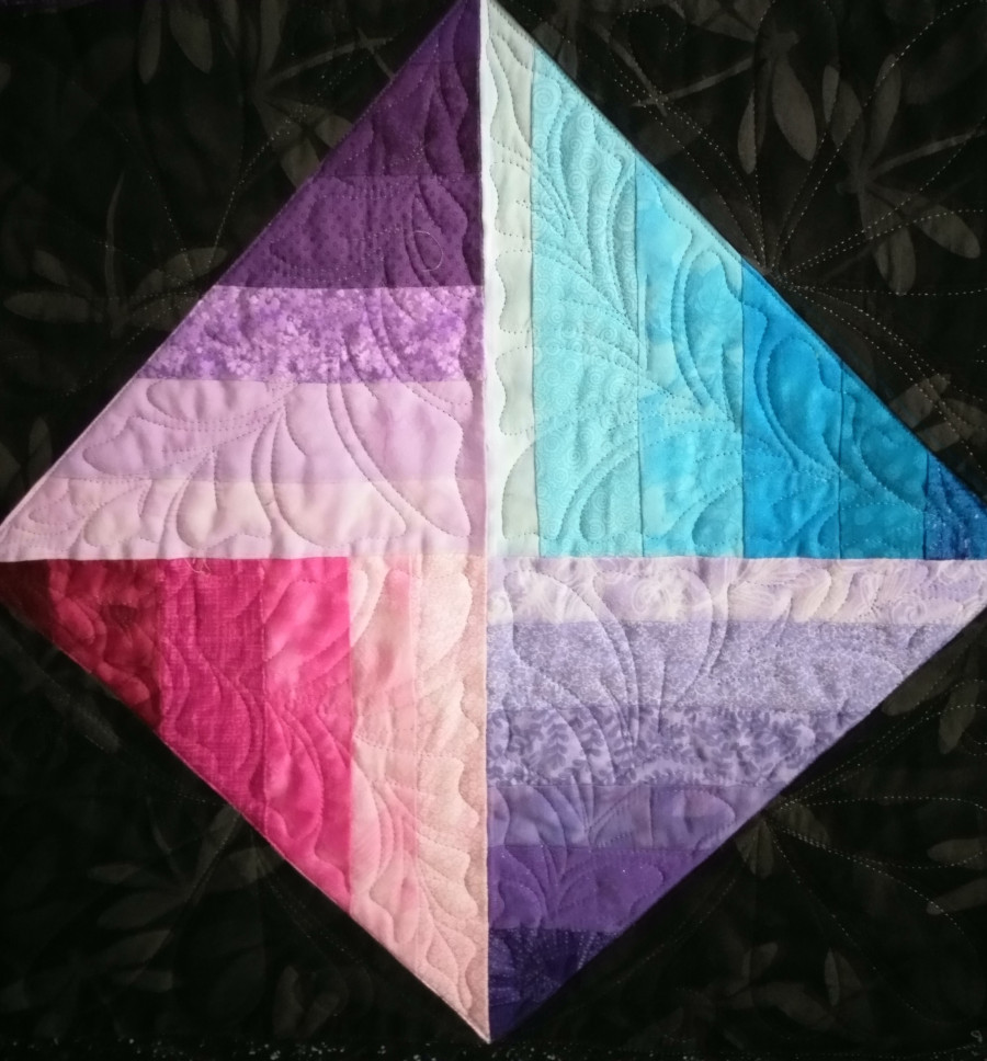
Some quilts dazzle with their depth and luminosity, and “Luscious Luster” by APQS Dealer Julia Graves sparkles with light! The rich black background makes the colors glow like a twinkling star in the night sky.
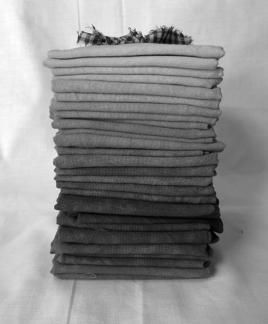
Julia points out that the key to successfully creating that “glow” is carefully choosing fabrics that have a range of values—from very light fabrics to very dark. In addition, fabrics that are solid colors or that “read” solid work best.
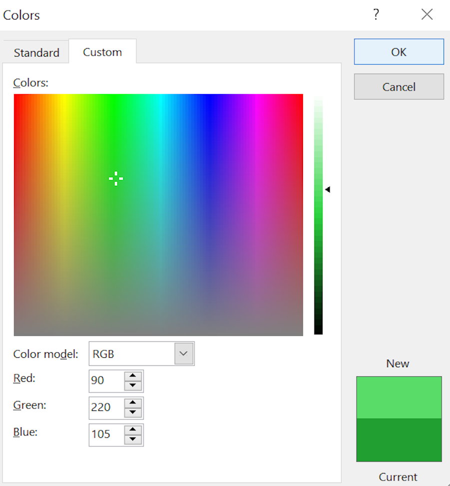
A fabric’s color is called its “hue.” A fabric’s value is adjusted by adding pure black or pure white to its color. To help illustrate the difference, take a look at the Microsoft Word’s font color dialog box. The hues are shown in the large box on the left. Once a color is selected, the slider bar on the right side of that box allows you to adjust the value by adding white or black to the hue.
When choosing the best fabrics for your quilt, value is impacted by the other fabrics around it. By itself, one fabric can look light—until an even lighter fabric is placed next to it. Then it could become a medium value. If you aren’t sure if your fabric values are different enough, here are some hints to help you choose wisely:
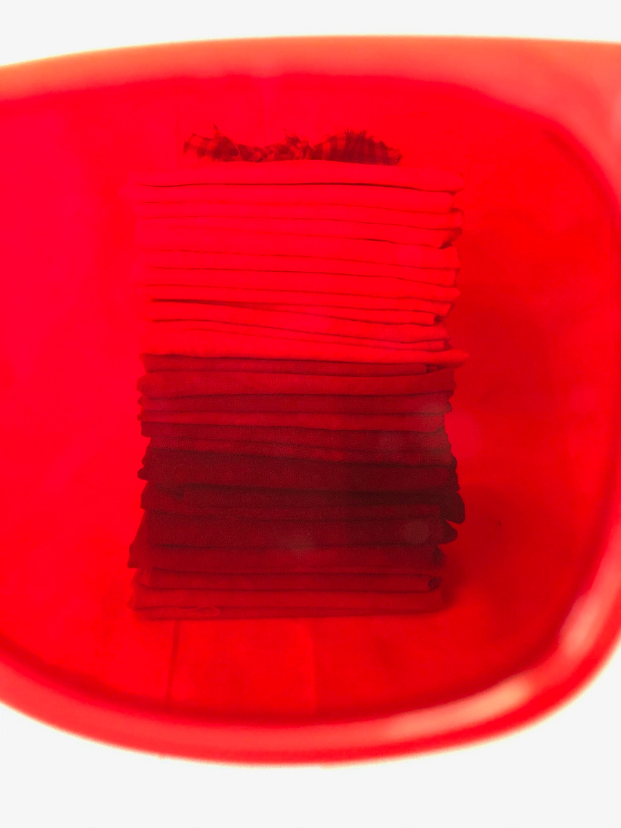
- Value finder glasses or red or green acrylic value finders can help remove the “color” from what you’re viewing and reveal only value. You can layer two pieces of red cellophane and get a similar effect. One downside to red lenses is that pinks and reds don’t always reveal correctly, so the green lens can help with that.
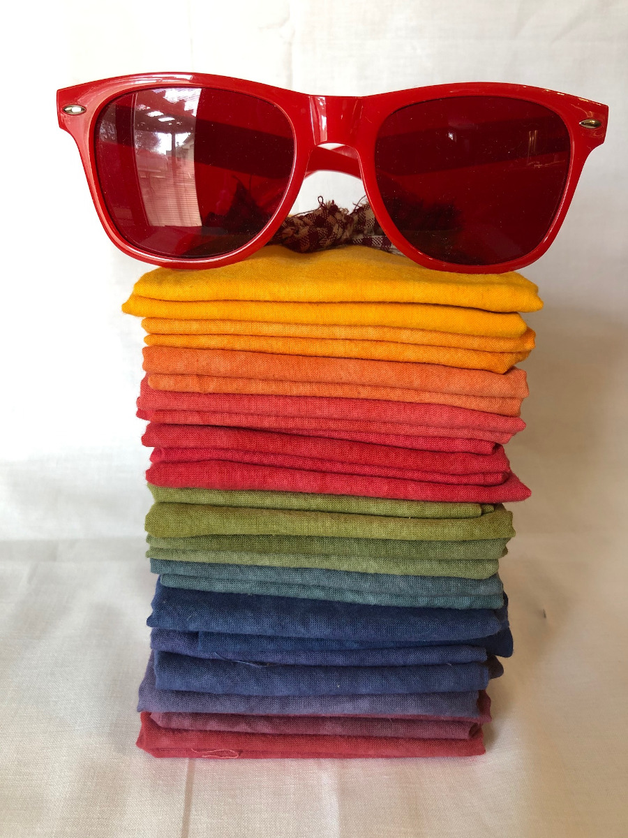
Notice that though the colors seem to progress from light to dark in this fat quarter bundle, when viewed through the red lens there’s a distinct break between dark and light values, and the middle range is hard to distinguish? Looks like it needs a few more medium values.
- Another option is to take a black and white photo of your fabrics so that you’re only looking at a grey scale to help perceive values. It’s easy to do that on most smart phones—take the photo, then open the photo in the editing software and remove the saturation (or select a black and white filter.)
- As a last resort, step back from your stack a few feet and try squinting your eyes when you look at your fabric swatches spread out to reduce the amount of incoming light. It’s not the best way to distinguish values, but it’s better than cutting up your stash only to find out later that the quilt is blah!
Julia’s amazingly simple pattern is perfect for using up scrap strips since they only need to be 9 inches long and can have varied widths. A fat quarter bundle with a wide value range is also an excellent choice. Choose a black or very dark background fabric for the most vivid punch.
Her experience with color principles shows that she knows her way around a color wheel. She created this quilt to showcase the concept of luster, which is the effect of light moving across an object. A large scrap stash combined with her love of all the colors in the rainbow led to making blocks with all the rainbow hues. But after playing with the half-square triangle blocks on her design wall, she discovered that the warm colored blocks of orange, red and yellow she’d made overpowered the cooler hues. The cooler hues were balanced enough that the luster shows through.
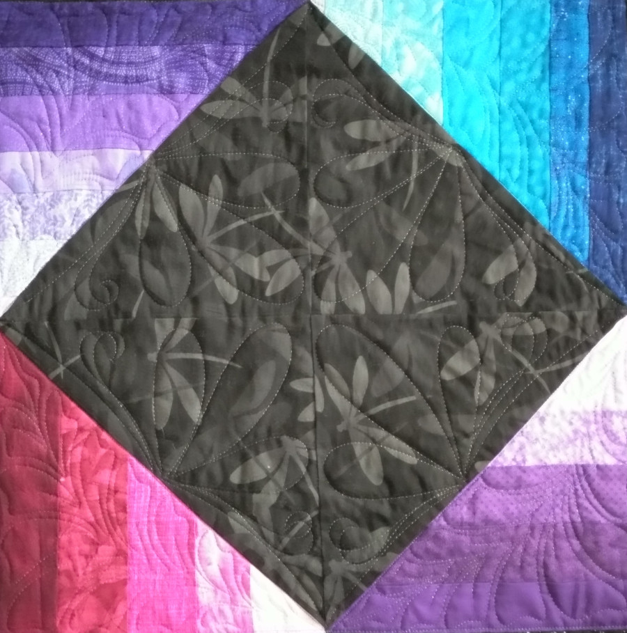
Julia placed the blocks in the shape of an “X” for the positive/negative effect that the colors make when compared to the background black fabric. She experimented with additional blocks and layouts in Electric Quilt and came up with a bonus layout included with the pattern for a sofa throw quilt. “Pink Ribbon” uses a deep brown for the background that complements the pink fabric well. If you squint your eyes, you can see a brown ribbon and an upside-down pink ribbon!
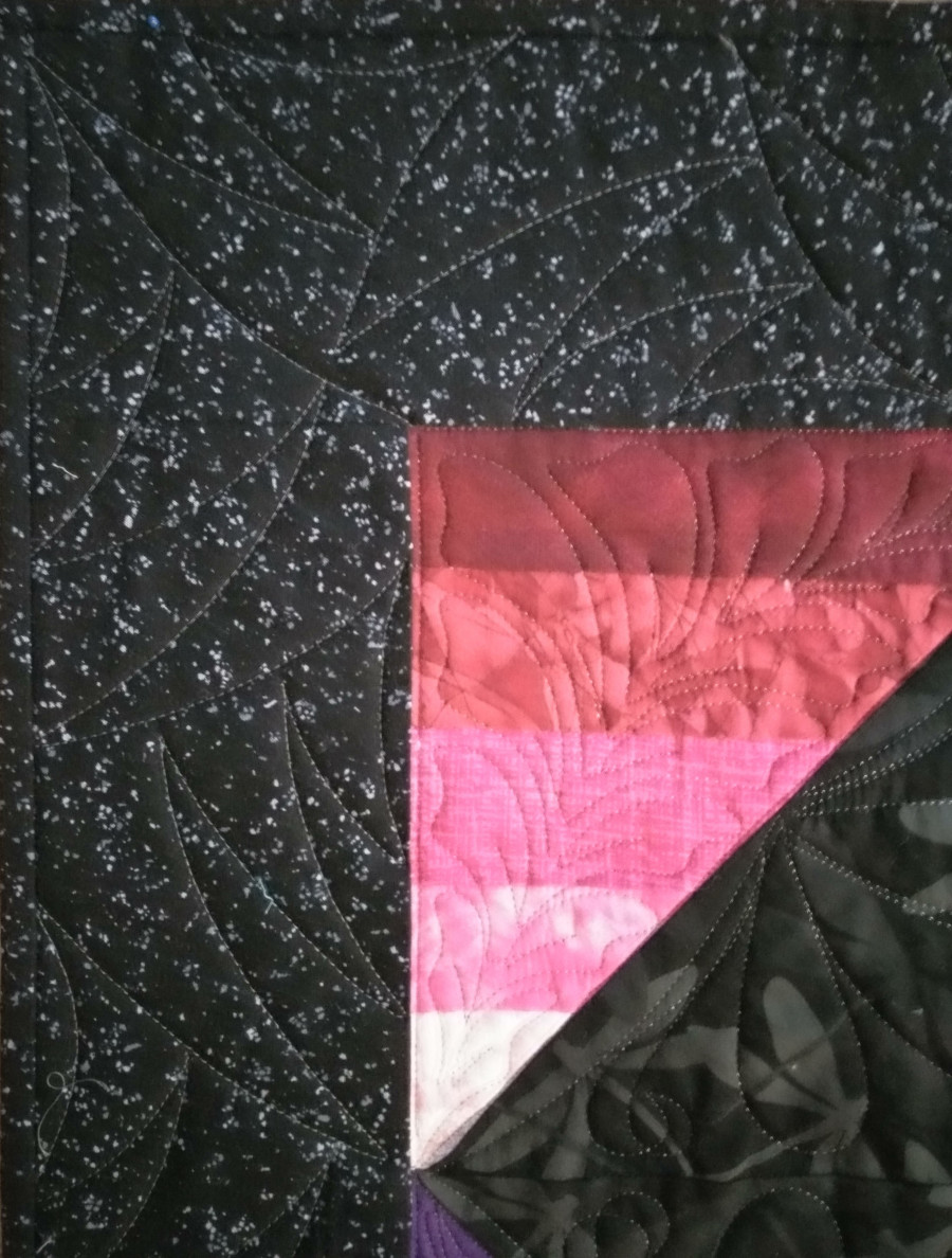
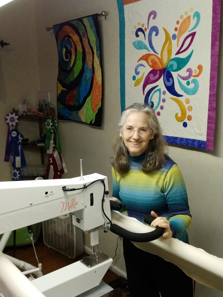
So that the thread color would not detract from the quilt’s luster, Julia used Superior Threads MonoPoly invisible thread on her APQS Millie to quilt molar-style feathers in the strip-pieced areas.
Quilter’s Dream wool batting helped create definition and add some depth to the darker fabrics, where she quilted loop feathers and arcs to contrast against the straight lines in the piecing.
As a quilter for the past 23 years, Julia’s passion moved from making quilts for her nieces and nephews to starting her own quilting business called “Special Occasion Quilts.” She now quilts for others, makes commission quilts, creates lots of charity quilts and teaches longarm and piecing classes. She’s also an APQS Dealer and Certified Technician, helping other APQS owners around Virginia and Washington, D.C. keep their machines running in tip-top shape.
She recently was an Artist in Residence at the 2019 Empty Spools Seminar in Pacific Grove, California, and will be an instructor there in 2021 teaching a class on Amazing Abstracts. We’re thankful that she is sharing her talent with us and this awesome free pattern so that we can all make lustrous quilts!